Introduction: Your Home Office Is Your Competitive Advantage
Remote work isn’t a trend anymore it’s a structural shift in how professionals work. According to recent data, approximately 22.8% of U.S. employees work remotely at least part-time, representing roughly 35 million people. And the numbers keep climbing.
But here’s the uncomfortable truth: simply working from home doesn’t guarantee productivity. What matters is how you design your space.
A Stanford study spanning 16,000 workers found that remote work increased productivity by 13% but only when the environment was intentional. Those working in carefully designed home offices reported fewer distractions, fewer breaks, and measurably better output. Meanwhile, poorly designed home offices become sources of distraction, stress, and burnout.
The difference often comes down to one overlooked element: the visual environment itself.
Your walls, colors, and artwork aren’t just decoration. They’re neurotransmitter triggers. They either support deep focus or sabotage it. And in 2026, smart professionals are designing their home offices around one key principle: visual calm paired with psychological stimulation.
This is where abstract art—specifically, thoughtfully selected calming patterns—becomes a productivity tool.
The Neuroscience of Focus: How Your Brain Stays on Task
To understand why the right artwork matters, you need to understand how your brain manages attention.
The “Traffic Directors” in Your Brain
Your brain is under constant assault by visual stimuli. Right now, as you read, your eyes are registering hundreds of potential distractions: colors, movements, shapes, text, shadows. Yet you can focus on this sentence. Why?
Neuroscientists at the University of Pennsylvania School of Medicine discovered the answer. In their research, they identified a set of neurons in the lateral prefrontal cortex (LPFC) that act as “traffic directors” for your visual attention. These neurons, called visual-movement neurons, essentially decide which visual stimulus you focus on and which you ignore.
The researchers observed something critical: when these neurons fire together in a coordinated pattern called “beta bursts,” focus strengthens. When beta bursts are strong before a distraction appears, your brain successfully ignores the distraction and maintains task focus. When beta bursts are weak, your attention gets captured by whatever bright, shiny, or novel stimulus appears.
In other words, maintaining focus is an active, energetically expensive process. It requires your brain to constantly suppress distraction.
Visual Distraction Is Contagious
Here’s where it gets concerning: a 2022 MIT study found that visual distractions don’t just capture your spatial attention they disrupt your entire attentional filtering system. Researchers presented participants with arrays of hybrid images (overlapping faces and houses). When participants were tasked with focusing on “houses,” a salient visual distractor (a white rectangle) would appear elsewhere on screen.
The result was surprising: not only did participants’ attention get captured by the distractor, but their brain’s category-based filters the systems that help them ignore irrelevant information completely broke down. The filter disruption was so profound that it temporarily reversed the brain’s attentional priorities.
Translation: A cluttered, visually chaotic home office doesn’t just distract you once. It disrupts your fundamental ability to filter distractions, making everything harder to ignore.
What This Means for Your Home Office
Your home office walls are either:
- Visual noise: Clashing colors, busy patterns, multiple focal points competing for attention, cluttered décor. Every glance costs cognitive energy as your brain’s traffic directors struggle to suppress distractions.
- Visual calm: Cohesive, intentional aesthetics, minimal competing stimuli, patterns that engage without demanding attention. Your brain’s attentional filters remain intact, preserving energy for actual work.
The difference in productivity can be 15-30% depending on the individual and task type.
Color Psychology: The Science Behind What You See
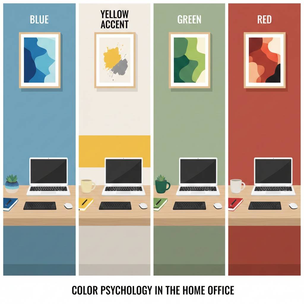
Colors aren’t subjective preferences. They trigger measurable neurological and physiological responses.
Blue: The Focus Color
Blue is the productivity champion. Multiple studies confirm that blue enhances concentration, stimulates thinking, and provides mental clarity. When applied to home office walls or artwork, blue:
- Reduces anxiety and promotes calmness
- Improves concentration and focus
- Supports sustained attention during detail-oriented work
- Lowers heart rate and blood pressure, creating a calm state
A 2026 study published in Nature compared workspace wall colors across four conditions: red, blue, green, and yellow. Productivity was measured objectively using proofreading tasks. Results showed productivity was significantly highest in blue conditions (alongside yellow and red), while green actually reduced productivity.
Why? Blue is cognitively soothing without being sedating. It supports focus without requiring emotional energy.
Yellow: The Optimism Color
Yellow stimulates innovation, creativity, and optimism. It works well for:
However, used excessively, yellow can overstimulate. The key is balance: a neutral base with yellow accents.
Green: The Balanced Choice (With a Caveat)
Green is associated with balance, growth, and nature. Interestingly, while nature-inspired imagery with green tones reduces stress, pure green walls or excessive green artwork can paradoxically reduce productivity. The 2026 study found productivity was lowest in pure green conditions.
The lesson: green works best as a nature element (plants, landscape artwork) rather than as a dominant color scheme.
Red: The Energy Color
Red increases heart rate, energy, and urgency. In short bursts, it can energize. But sustained exposure to red increases anxiety and stress, making it unsuitable for focused work environments.
The Color Psychology Summary for Home Offices
| Color | Effect on Focus | Best Uses | Avoid |
|---|---|---|---|
| Blue | Enhances concentration, calms mind | Primary color for focused work zones | Excessive blue can feel cold |
| Yellow | Stimulates creativity, boosts optimism | Accents for creative days | Overuse causes overstimulation |
| Green | Balances mood (when nature-based) | Plants and natural imagery | Pure green as dominant color |
| Red | Energizes but increases stress | Brief, motivational accents only | Long-term exposure in work zones |
| Warm neutrals | Supports ease and collaboration | Break areas, meeting nooks | Not suitable for intense focus zones |
Abstract Patterns: Engagement Without Distraction
This is where abstract art becomes a strategic tool.
Why Abstract Patterns Work
Unlike realistic imagery, abstract patterns have a unique property: they engage your brain’s pattern-recognition systems without demanding narrative attention.
When you look at a photograph of a landscape, your brain automatically engages several systems:
- Face recognition (if there are people)
- Narrative construction (“What is this scene about?”)
- Emotional response (“Is this safe? Threatening? Peaceful?”)
- Memory association
This takes cognitive resources away from your actual work.
Abstract patterns, by contrast, trigger your brain’s aesthetic appreciation and pattern recognition, satisfying your need for visual interest without triggering narrative processing. You find them beautiful or engaging, but they don’t demand your story-making brain.
In essence, abstract art is visually stimulating but cognitively quiet.
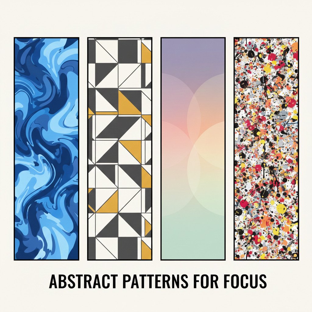
The Best Abstract Patterns for Focus
Flowing, organic patterns: These mimic natural flow and have a calming effect. They’re mathematically interesting (they engage your visual system) but not cognitively demanding.
Geometric progressions: Patterns that follow mathematical rules (repeating shapes, fractal-like structures) satisfy your brain’s pattern-seeking nature without creating visual chaos.
Soft, overlapping forms: Instead of sharp contrasts or high-frequency visual noise, patterns with soft edges and gradual transitions keep the brain calm.
Color-gradient patterns: Abstract art that uses color psychology (e.g., soft blues and purples that transition smoothly) combines color therapy with visual interest.
What to Avoid in Abstract Office Art
- High-contrast, jarring colors: Red and black sharply juxtaposed creates visual tension.
- Chaotic, dense patterns: Overly busy abstractions feel visually demanding, not soothing.
- Purely representational art in busy environments: If your home office is already stimulating, figurative art can overwhelm.
- Multiple competing focal points: Art with many areas demanding attention creates the same distraction problem you’re trying to solve.
The Research Connection: Why Art Reduces Stress and Boosts Productivity
The relationship between art and productivity isn’t anecdotal. Multiple peer-reviewed studies confirm the effect:
Study 1: Stress and Concentration (2024)
Employees working in environments adorned with art reported significantly lower stress levels and higher levels of concentration compared to those in blank, art-free offices. The effect was strongest when art was abstract or nature-inspired.
Study 2: Mental Well-being (2025)
Exposure to art in workspaces improved mental health by satisfying psychological needs for autonomy (control over environment) and competence (feeling capable). This translated to better overall well-being.
Study 3: Specific Art Effects (2024)
Research on workplace art found:
- 78% of respondents agreed that art reduced stress levels
- 64% stated that art increased and inspired creativity
- Art in offices reduced anxiety, distress, and fatigue
- Viewing art activated the brain’s reward system, releasing dopamine
Study 4: Color Psychology (2026)
The Nature study comparing wall colors in simulated workspaces found that color significantly influenced productivity. Blue and yellow environments showed the highest productivity metrics, while green (paradoxically) showed the lowest.
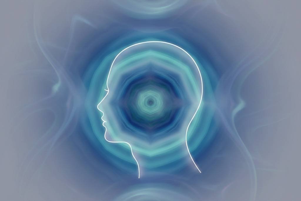
The Mechanism: How Art Reduces Cognitive Load
When you view beautiful, calming artwork:
- Your reward system activates: The brain releases dopamine, creating a mild positive mood.
- Stress hormones decrease: Cortisol and adrenaline drop, allowing your nervous system to relax.
- Your attentional filters strengthen: By reducing ambient stress, your brain’s traffic-director neurons (the LPFC visual-movement neurons) function more efficiently.
- Mental energy is preserved: You’re not expending resources fighting visual noise, so more cognitive capacity remains for actual work.
The result: you focus deeper, longer, and with less mental fatigue.
Designing Your Focus-Friendly Home Office: A Practical Framework
Now that you understand the why, here’s the how.
Step 1: Choose Your Focus Color Base
Determine the primary color for your work zone:
- For analytical, detail-oriented work (data analysis, writing, editing): Blue or cool-toned environments
- For creative work (design, strategy, brainstorming): Blue with yellow accents
- For balanced work (meetings, communication, varied tasks): Warm neutral with blue-toned art
Keep the dominant color calming. You want your brain’s beta bursts supporting focus, not fighting stimulation.
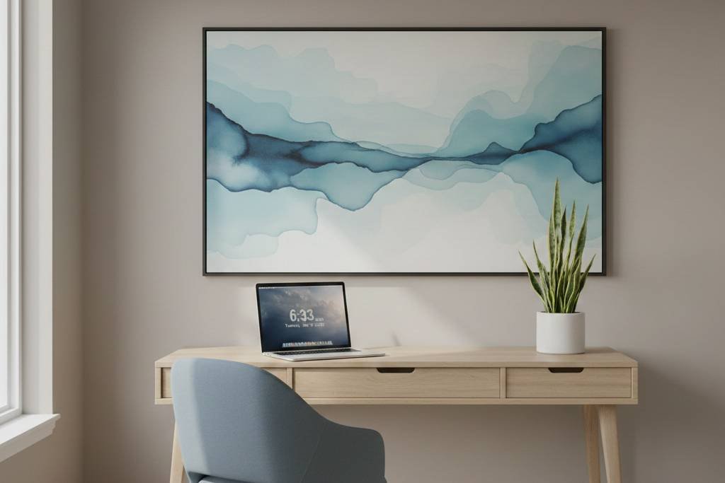
Step 2: Select Abstract Art Strategically
Choose 1-3 pieces of abstract art that:
- Use your chosen color palette: If blue is your focus color, select abstract art that incorporates blues, soft purples, and warm neutrals.
- Feature flowing or geometric patterns: Avoid busy, chaotic abstractions. Choose patterns that feel organized yet organic.
- Are placed in your primary sight line: Position art where you’ll see it during breaks, but not directly in your line of sight to your work. (You want it to be a mental rest point, not a distraction.)
- Match the scale of your space: A single large piece often works better than multiple small pieces; it reduces competing focal points.
Step 3: Manage Visual Clutter Elsewhere
Art isn’t the only visual element in your office. Consider:
- Desk organization: Hide cables, minimize items on your desk surface. Visual clutter increases cognitive load.
- Storage: Closed storage (shelves with doors, filing cabinets) reduces visual noise compared to open shelving.
- Neutral backgrounds: Keep wall colors (outside your art) neutral or soft. Avoid multiple competing colors.
- Minimal decorative objects: Each item in your field of view is a potential distraction. Less is genuinely more.
Step 4: Layer in Technology and Biophilic Elements
Modern home offices in 2026 combine artwork with:
- Plants: Real or high-quality artificial plants add biophilic calm without visual noise.
- Natural light: Maximize window access and use full-spectrum lighting that mimics natural light.
- Acoustic panels: Soft surfaces (felt, cork) reduce sound bounce and visual harshness compared to hard surfaces.
- Hidden technology: Cables, monitors, and tech should be as invisible as possible.
Algorithmic Art for Focus: A New Frontier
Here’s where personalized, algorithmic abstract art becomes uniquely powerful for home offices.
The Advantage of Algorithmic Patterns
Algorithmic generative art abstract patterns generated from mathematical rules and personalized inputs offers a unique benefit: visual uniqueness without cognitive demand.
Unlike mass-produced abstract art, algorithmic pieces are generated from your inputs (date, preferences, parameters). The result:
- Personally relevant: The artwork is generated from data meaningful to you, even if you’re not consciously aware of the connection.
- Visually cohesive: All algorithmic pieces from the same artist/algorithm family have visual DNA that ties them together, reducing cognitive friction.
- Mathematically grounded: Underneath the visual beauty is mathematical order, which your brain finds satisfying.
- Never identical to anyone else’s: Unlike mass-produced prints, your algorithmic art is genuinely unique, reinforcing the sense that your space is yours.
Using Algorithmic Art for Different Work Modes
Different work modes benefit from different algorithmic parameters:
For Deep Focus Work (writing, analysis, coding):
- Use algorithmic art generated with lower chaos parameters
- Cooler color palettes (blues, purples)
- More geometric, structured patterns
- The piece itself becomes a visual anchor, reminding you: “This is focus mode”
For Creative Work (design, brainstorming, strategy):
- Use algorithmic art with higher visual complexity
- Warmer accents (yellows, warm oranges) within a cool base
- Flowing, organic patterns with surprise elements
- The piece stimulates lateral thinking without demanding narrative attention
For Rest Breaks:
- Algorithmic art with very soft, nature-inspired color palettes
- Minimal visual complexity
- The piece becomes a mental reset point
Phygital Integration for Home Office Art
Algorithmic art is uniquely suited for phygital enhancement:
NFC-Enabled Productivity Tips: Your algorithmic artwork includes a hidden NFC tag that, when tapped, reveals:
- A productivity quote or focus tip
- The mathematical concept behind the pattern
- A timer or break reminder
AR Visualization: Scan your algorithmic art to see:
- An animated visualization of how the pattern was generated
- Interactive sliders showing alternative parameter variations
- An explanation of the algorithm’s visual rules
Smart Display Rotation: On a smart frame, your algorithmic art can:
- Cycle through variations throughout the day (morning focus mode, afternoon creative mode, evening rest mode)
- Change intensity or color saturation based on time of day
- Highlight different aspects of the pattern as you interact with your space
Practical Setup Guide: From Concept to Focused Reality
The 90-Day Home Office Transformation
Week 1-2: Assessment
- Identify your primary work mode(s): analytical, creative, or hybrid?
- Audit your current space for visual clutter, competing colors, and distractions
- Measure your current baseline: How long can you focus before distraction? How’s your mood at day’s end?
Week 3-4: Color and Base Setup
- Choose your primary focus color (likely blue or cool-toned)
- Neutralize competing colors on walls and furniture
- Add one piece of abstract art in your chosen color palette, positioned for peripheral viewing during breaks
- Implement basic cable management and storage organization
Week 5-8: Optimization
- Add plants and natural elements
- Optimize lighting (full-spectrum, non-glare)
- If using algorithmic art, select personalized pieces with meaningful inputs
- Test different configurations; track focus duration and mood
Week 9-12: Refinement
- Remove anything that doesn’t serve focus or well-being
- Add phygital elements if desired (NFC, AR, smart frames)
- Establish a ritual: same time, same space, intentional focus
- Document your setup for future reference and adjustment
Quick Checklist for Focus-Optimized Home Offices
- Primary color is calming (blue, cool tones, or warm neutrals)
- 1-3 pieces of abstract art, positioned for peripheral rest, not distraction
- Desk surface is clear (monitor, keyboard, coffee, pen nothing else)
- Cables are hidden
- Storage is closed or minimal
- Natural or full-spectrum lighting is optimized
- At least one plant or natural element is visible
- Artwork reflects your personal identity or meaningful data
- A clear visual or ritual marks the start and end of focus time
- Your background (for video calls) looks intentional and calm
Conclusion: Your Home Office as a Productivity Instrument
Remote work is here to stay, and your home office is no longer a temporary setup it’s where you spend 40+ hours per week. The question isn’t whether to invest in your environment; the question is whether to invest intentionally.
The neuroscience is clear: visual environment shapes focus. Color psychology is measurable. Abstract art reduces stress and enhances concentration. The research isn’t theoretical; it’s based on brain imaging, productivity measurements, and workplace experiments across thousands of workers.
Your home office walls aren’t decoration. They’re tools. Neurotransmitter triggers. Productivity amplifiers.
In 2026, the most successful remote workers aren’t just disciplined—they’re strategic about their surroundings. They choose colors for focus. They select abstract patterns for calm stimulation. They eliminate visual noise. They understand that a well-designed environment isn’t a luxury; it’s a necessity.
The best part? You don’t need a designer or a large budget. You need intention.
Pick one color that calms you (likely blue). Choose one or two pieces of abstract art that you genuinely enjoy. Clear your desk. Hide your cables. Add a plant. Notice the difference.
Within weeks, you’ll likely find yourself more focused, less stressed, and genuinely looking forward to your work hours.
That’s not coincidence. That’s neuroscience in action.
Leave a Reply